

Engagement is up. Your brand is seeing a spike in mentions. Sentiment is trending positive. People are sharing a hack about one of your new products. They’re all positive signs, but if you can’t translate what they mean to the business, those numbers stay trapped and nothing changes off the back of that good momentum.
That’s where social teams find themselves stuck. The data they have access to is often the freshest, most unfiltered view of what the market is actually saying, filled with unprompted takes and reactions from the world’s largest focus group. But according to the 2026 Social Intelligence Report, only 36% of organizations are able to use those insights to regularly inform decisions outside of marketing.
That’s when a data problem becomes a storytelling problem. Building a narrative around the data and helping people understand why it matters, and what it means to them, is crucial to help insights from social have an actual business impact.
So what makes a story land? How do you visualize data and shape it into something that drives a recommendation? Below, we’ll cover what data storytelling means for social teams specifically, the building blocks of how to make those stories resonate and a step-by-step framework for putting one together, as well as what to avoid.
What is data storytelling?
Data storytelling is the practice of merging data science, narrative and visualization to give life to the insights in a dashboard, honing in on what they mean and why decision-makers should care. In short, it’s translating the numbers in a spreadsheet into a compelling story, which ultimately leads to a decision being made.
Social is a prime source for this kind of data storytelling, as it offers market intelligence for the business. Every other data source (including CRM records, support tickets, pipeline reports, etc.) reflects what customers do once they’re already actively engaged with you in some way. Social captures live reactions from a much wider audience, with unprompted takes that show up there before anywhere else. A spike in comments questioning a pricing decision or a wave of praise for a feature being deprecated is a story that should be told across the business, not sitting in a dashboard.
Social listening and other tactics can help you find those signals, but shaping them into a story that makes the rest of the business sit up and take notice is where data storytelling comes in.
Why data storytelling matters more than ever
Being able to translate insights into something people can take into their decision making is a key skill for teams that work cross functionally, like the social team. Though the same data is the basis for every narrative, each team wants it packaged differently, as a story that’s relevant to them, and being able to act as that translation layer increases any team’s influence.
For example, executives naturally lean on quantitative data because there’s an easy map to the bottom line. So show them how audience growth or engagement correlates with pipeline, or how improved response time correlates with retention. That’s the basis of the story they want to hear. But qualitative data also matters, whether that’s comments, screenshots or customer feedback. This adds color to the story and helps build it into a narrative that backs up the numbers.
This is important because 86% of organizations say they’ve missed real business opportunities in the past two years because insights from social were delayed, siloed or underused. Some of that might be a data problem, but much of it is a governance problem. The insight exists but isn’t getting to other teams, or it was never shaped into a narrative a decision-maker could act on before it was too late.
That’s why data storytelling is so important. It’s more than a visualization of data, it’s the narrative that helps define how to improve the business.
The building blocks of a strong data story
Like any good story, a data story needs to be built with the audience in mind. That starts with knowing who’s going to be receiving it, then selecting the right data to highlight and translating it into language they already use.
- Executives and leadership want to understand business impact. Translate social metrics into revenue, retention or risk, with charts they can understand at a glance.
- Product and R&D want signals distilled from qualitative feedback. Show them examples of what customers are asking for or struggling with, highlighting the voice of the customer.
- Customer care wants to see impact. Frame the story around volume, response time and improvements to process.
Once you know the audience, you can go about building the narrative.
Ground your insights in contextual data
Numbers without context leave more questions than answers. Contextualize the change within your wider industry and competitors. Pair quantitative data that shows what happened with qualitative data that shows why it happened. Don’t just report a number, show why the number changed and what it means for the business.

Visualize with intent
Every visual should make your story easier to grasp, not just fill space. Keep a few rules in mind:
- Choose colors that support your message and avoid distracting from it.
- Design for readability first; a chart should communicate at a glance.
- Avoid complexity. If a visual needs a long explanation, simplify it or split it in two.
- Match the format to how it’s being received. A dense report table works fine in a document; it will rarely land in a live presentation.
Give it a narrative arc
The most memorable data stories follow a familiar shape: set the scene, introduce the obstacle, hit the climax and land on a resolution. Applied to a social report, that might look like: here’s where we started, here’s what changed and why, here’s the turning point in the data, and here’s what it means going forward. That structure is what makes people remember the story after they leave the room—and repeat it accurately when they explain it to someone else.
Get our template for creating a compelling data story
A step-by-step framework for building a data story
To make sure your data story demonstrates value, follow these steps before sharing your insights.
1. Identify the most interesting points
Put on your author cap and ideate the structure of your data story.
Have a main objective in mind, whether it’s relaying campaign status or justifying a bigger budget. What pieces of quantitative and qualitative data best support the main idea you want to convey? What data points directly contradict what you thought was going to happen?
2. Lead with your second most interesting piece of data
Don’t show your whole hand, but do command attention right at the beginning. For instance, you might say something like, “As you already know, sales are up this quarter. What you may not have seen is that this trend correlates with our increase in traffic from social.” Include any other interesting points after this, but don’t share your best one just yet.
3. Use visual aids as you share
Let those visuals we discussed earlier shine. An example: “As you may already know, sales are up this quarter,” (graph of this quarter’s sales appears). “What you may not have seen is that this trend correlates with our increase in social media traffic,” (the second graph of traffic by social networks appears as an overlay to the first graph). The visuals here add context to your data storytelling.
4. Predict questions or challenges
Naturally, your audience will analyze what they are seeing. In the example we’ve used so far, they may ask something like, “How do we know sales are up because social traffic is up, and not the other way around?” Incorporate slides or bullet points that answer the questions you expect your audience to ask. Questions are a good thing: They keep your audience engaged as you get ready to deliver your grand finale of data insight.
5. Save your best point for last
Leave your audience with takeaways they’ll remember by sharing your most interesting piece of data last. For instance, you could say, “We considered that correlation might not indicate causation, so we dug a little deeper and looked at the shares, social referrals and conversions. We were able to trace 33% of our new customers this quarter to one particular influencer’s post,” (screenshot of post here) “in which she raved about how our product helped her. She has over 700,000 followers, many of whom also shared the post and clicked through to our site from it.”
Notice how this example answers the question from the audience while providing quantitative and qualitative data. This sweet spot is what will make your data storytelling memorable and impactful.
6. Close with the “so what”
Data storytelling in marketing should always aim to answer the question “so what?” Round out your presentation with why this story matters to your overall social media and business goals. Then share how you’ll use this data to inform new ideas moving forward. For example, because this one influencer post did so well, you’re looking to partner with other influencers who have similar audiences.
This flexible format can be repeated as needed and applied to just about any medium, from presentations to reports and emails.
You may have lots of data to comb through to find the right points to cover. That’s why the first step is picking out the most interesting ones. It’s up to you to gather the data that best illustrates your main plot point and use it to focus your audience on the key message.
7. What to avoid when creating your data story
Social data in action is a beautiful thing, but there are a few things to avoid when developing your data story:
- Ignoring your audience’s priorities
- Overloading the story with too many metrics
- Leaving out qualitative context
- Using visuals that distract instead of clarify
- Skipping visuals altogether
- Leaning on text formatting instead of a real visual
- Presenting a weak result with no context or path forward
Examples of effective storytelling with data
Get inspired with these data storytelling examples:
1. Jetpack AI
Jetpack AI shows that data storytelling doesn’t need to be complicated to be compelling. Their baby names visualization allows users to input any baby name and see how it has changed popularity in the US, shown as a line graph and changing letter sizes.

There’s a gamification element to this, where users are invited to submit their own, encouraging learning and active participation from the recipient.
2. The Pudding
The Pudding is well known among fans of data journalism, consistently setting the standard for visual storytelling.
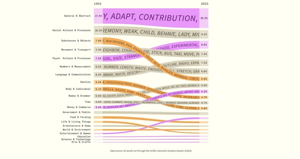
One of their recent pieces looks at the popularity of English words over time. Interactive elements keep the user hooked, and offer clear explanations that contextualize the data points they’re highlighting.
3. Sprout Social
Sprout has some excellent data storytelling as well. Our data reports, like the 2026 Influencer Marketing Report, feature digestible narratives and visual aids.

Remember: Your visuals don’t have to be graphs and charts. You can use a graphic to emphasize a stand-out data point. The data gives context and suggests an action for the reader to take off the back of the data.
Craft a story that travels
A good data story earns attention in the room where you present it. A great one gets picked up and repeated in the rooms you’re not in, quoted back to you by an executive or referenced by product as the reason a feature made the roadmap.
Getting there takes more than just a chart. It takes knowing your audience, pairing your numbers with the context that makes them mean something and closing every story with a clear next step. Download our social intelligence metrics analysis template to start organizing your data into a story worth telling.
The post Data storytelling: Turning social insights into a narrative your org acts on appeared first on Sprout Social.